What Are the Top Tile Photo Frame Designs?
A Tile Photo Frame can turn a favorite photograph into a small, tactile focal point. Its appeal depends on more than color: tile finish, grout lines, frame depth, and the image itself all shape the result. Glossy ceramic can brighten a dim hallway, while matte stone-look tiles feel quieter beside a wooden shelf. Small choices matter.
The broader home-design market offers useful context, though it does not measure tile photo frames specifically. Houzz’s 2024 U.S. Houzz & Home Study reported that median homeowner spending on renovation projects reached $24,000 in 2023. That figure reflects a strong investment in living spaces, not demand for any single accessory. There is no widely cited public report isolating Tile Photo Frame sales, and a verifiable quote from a specialist focused specifically on this product is difficult to establish. Rather than invent one, this guide uses a sound design principle from William Morris, the British designer: “Have nothing in your houses that you do not know to be useful, or believe to be beautiful.” A frame should earn its place. It should protect and present the image, while fitting the room’s palette and scale. The designs ahead compare modern, rustic, mosaic, and minimalist approaches, with practical details on materials, placement, and care. Some combinations may look better in a catalog than in a real home. That deserves a second look.
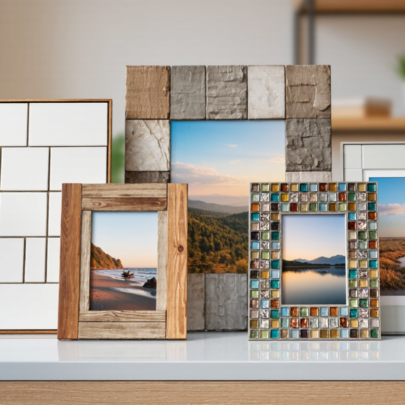
What Defines a Tile Photo Frame?
What Are the Top Tile Photo Frame Designs?
What Defines a Tile Photo Frame?
A tile photo frame uses a flat tile as its visible face, border, or structural support for a photograph. The tile may be ceramic, porcelain, glass, or another sturdy material. Its surface can be glossy, matte, textured, or printed, but the photo still needs a clear, readable area. A frame might hold a small image behind a cutout, or display a photo directly on the tile. These are different constructions, so check how the image is attached before choosing a design.
The tile’s weight and edges affect how the frame works in a room. A thick ceramic tile can feel substantial on a desk, but it needs a stable base. Wall-mounted styles require secure hanging hardware suited to the frame’s weight. That matters. A smooth, glazed face is easy to wipe, though fingerprints may show under bright light. A textured edge adds character, but can compete with a busy photograph. Match the photo’s colors and crop to the tile’s shape; a square portrait may not suit a narrow rectangle. Also check whether the image has a protective cover. Without one, dust and handling can mark the print over time. The overlooked detail is often the back: a neat front means little if the stand wobbles. There is no perfect format, and some designs look better in a shop than on a crowded shelf.
Common Materials Used in Tile Photo Frames
Tile photo frames can be made from several materials, each giving a different look and level of durability. Ceramic tile is popular for its glossy surface and broad range of colors. It works well with painted patterns or printed photographs, but the finished frame can chip if dropped. Handle the corners with care.
Porcelain is denser and less absorbent than standard ceramic. That makes it a practical choice for a frame near a sunny window or in a room with changing humidity. Glass tiles offer a bright, reflective finish, though fingerprints and dust show easily. A soft cloth helps keep them clear. Natural stone, such as slate or marble, brings visible grain and subtle color shifts. No two pieces look exactly alike. Its weight may require stronger backing and secure hanging hardware.
The tile is only part of the frame. A wood or metal base can support the pieces, while grout fills gaps and helps create a finished surface. Check that the backing suits the frame’s weight before hanging it. Small tiles may look delicate, yet they can add up quickly. Material descriptions do not always reveal how heavy a finished frame will feel. I would leave room for slight color variation, especially with natural stone; matching every piece perfectly can make the design feel less natural.
Popular Tile Photo Frame Design Styles
Popular tile photo frame designs often borrow from larger interior trends, but small scale changes everything. A classic subway-tile frame feels clean and familiar, especially with narrow white pieces and pale grout. For a warmer look, handmade-style tiles add slight color shifts and uneven edges around the photo. Geometric mosaics create more energy, though busy patterns can compete with a detailed image. Keep the picture in focus.
Houzz’s 2024 U.S. Kitchen Trends Study reported that ceramic or porcelain tile was the leading backsplash material, chosen by 54% of renovating homeowners. That figure concerns kitchens, not photo frames, but it suggests why tile remains a familiar decorative choice. On a frame, porcelain suits crisp, even edges; ceramic offers more surface variation. A matte finish can soften glare near a window, while glossy pieces catch light. Test a small sample beside the photograph first.
Color and grout matter as much as tile shape. Deep green or blue tiles can give a portrait a rich border; cream and sand tones feel quieter beside family snapshots. Thin grout lines make a mosaic look less fragmented, while contrasting grout emphasizes each piece. I still find that strong patterns sometimes look better in sketches than on the finished frame. Check the scale before committing. Houzz’s remodeling data is not a design rule, and individual lighting can change how colors read.
Patterns and Decorative Details for Tile Frames
Tile photo frames can feel handmade or crisp, depending on their pattern. A simple checkerboard of cream and charcoal tiles adds structure without competing with the photograph. For a softer look, try small floral motifs or alternating pale blue and white squares. Keep the pattern scale in proportion to the frame; tiny tiles can make a wide border look busy.
Decorative details often matter as much as the main pattern. A thin line of contrasting tiles can define the inner edge and draw the eye toward the image. Raised corner pieces, glazed accents, or a narrow mosaic strip add texture, but too many features may crowd a small photo. Small details matter. Check how glossy surfaces reflect nearby windows before choosing a finish.
Grout color changes the whole effect. Matching grout makes individual tiles blend together, while a darker shade emphasizes their shape. For a balanced design, repeat one color from the photograph in the border, then keep the remaining tones quiet. Measure the frame opening before laying out a pattern, especially with patterned tiles that need alignment. There is no perfect formula, and a sample layout may still look different in changing light. That small uncertainty is worth allowing for.
How to Choose a Tile Photo Frame for Your Space
Choosing a tile photo frame starts with the photograph and the wall, not a trend. Measure the print, then check whether the frame’s opening will crop faces or important details. A slim border suits small snapshots, while a wider tile can give a landscape more presence. Hold a paper cutout against the wall before you buy. It helps.
Color changes with the light. Warm cream tiles can soften a bright hallway, while charcoal or deep blue may anchor a pale room. Compare a sample with the paint and nearby furnishings in daylight and again in the evening. Glossy surfaces reflect lamps and windows; matte finishes usually keep attention on the image. Even a careful color match can feel slightly off once the frame is on the wall.
Check the frame’s weight and attachment method against the wall surface. Use fixings rated for both the frame and the wall type, and follow the frame’s installation guidance. For a group, keep spacing consistent, but do not force every tile into a rigid grid. A slight difference in height can feel considered—or simply look uneven. Lay out the arrangement on the floor and adjust it before drilling.
What Are the Top Tile Photo Frame Designs? - How to Choose a Tile Photo Frame for Your Space
| Design | Typical look | Works well in | Photo and tile considerations | Best for |
| Clean single-tile border | One continuous row of square or rectangular tiles around the image. | Modern rooms, desks, shelves, and simple gallery walls. | Choose a calm glaze or neutral color so the border does not compete with the photograph. Check that the frame opening suits the photo format. | A balanced, understated display. |
| Mosaic tile frame | Small pieces in a repeated pattern, a color blend, or a simple border motif. | Eclectic spaces, colorful interiors, and casual family-photo displays. | Many grout lines create visual texture. Keep the photo and surrounding decor relatively simple for a more legible focal point. | Adding color and handcrafted character. |
| Geometric or patterned border | Repeating shapes, contrasting bands, or a small decorative pattern. | Rooms with coordinated patterns or a defined accent color. | Use the room’s existing colors as a guide. A busy pattern can draw attention away from a detailed or colorful photograph. | A decorative accent that connects with a room’s palette. |
| Handmade or irregular-edge tile | Tiles with slight variations in shape, surface, or glaze for an artisanal appearance. | Relaxed, rustic, or craft-focused spaces. | Natural variations are part of the look. Inspect the edges and backing to ensure the finished frame sits securely on a shelf or wall. | A one-of-a-kind, tactile finish. |
| Large-format tile border | Fewer, larger tile pieces create broad, uncluttered border sections. | Open shelves, larger desks, and rooms with a minimal look. | The frame may feel visually substantial. Compare its overall size with the display surface and the image before choosing. | A bold border with a simple finish. |
| Mixed-material tile frame | Tile combined with materials such as wood, metal, or glass. | Interiors that already combine different finishes. | Check that the finishes complement nearby furniture and hardware. Consider the total weight if the frame will be wall-mounted. | Bringing together multiple materials in a room. |
Choosing tip: Match the frame’s color and pattern to the room, then check the photo opening, overall dimensions, backing, and hanging hardware. Tile can make a frame heavier than a basic wood or plastic frame, so use suitable support for its weight.